Quick answer: good church website design is built for the first-time visitor. Within a few seconds on a phone, they should see service times and location, what to expect, what is available for their children and how to get in touch. Sermons, events and online giving come next, and everything should be easy for volunteers to update.
I have built websites for churches and ministries, and the pattern is always the same. The old site was designed around the people already in the pews: long welcome letters, ministry lists, internal announcements. Meanwhile the person who matters most, the one deciding whether to visit this Sunday, could not find the service time.
Design for the person who has never been inside
Before someone visits a church for the first time, they usually check the website. They are a little nervous, and they have practical questions:
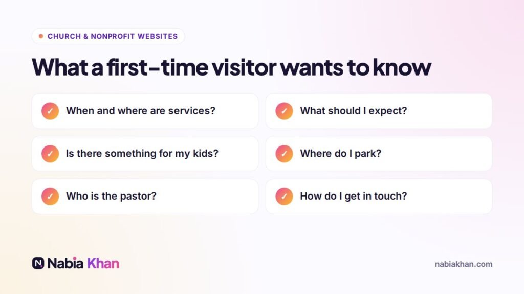
Put service times, address and a “Plan your visit” button at the top of the homepage. Do not make people scroll or click through menus to find them.
The pages every church website needs
- Plan your visit: service times, parking, what to wear, how long services last, what happens with children, accessibility.
- About: what you believe in plain language, your story and your leadership team with real photos.
- Kids and youth: safety, check-in process and what children do during the service. Parents read this page carefully.
- Sermons: recent messages as video or audio, searchable by series or topic.
- Events: a simple calendar that volunteers can update.
- Give: secure online giving with a clear explanation of where donations go.
- Contact: a short form, phone number, email and a map.
For the full list with details, read what a church website should include.
Use real photos
Stock photos of strangers smiling in a generic auditorium do more harm than good. Visitors want to see your building, your people and your atmosphere. A volunteer with a decent phone and good light can take everything you need on one Sunday.
Make it easy for volunteers
Church websites are usually updated by volunteers or busy staff. The site should let them add a sermon, update an event or change a service time in a couple of minutes without breaking the design. I build church sites on WordPress with simple editing screens, and I record a short video guide for whoever will update it.
Mobile first, always
Most visitors check your site on a phone, often on the way to the service. Big buttons, tap-to-call, tap-for-directions and a fast-loading page matter more than any visual effect.
Online giving that people trust
Use a well-known giving platform, explain how gifts are used and keep the giving page simple. One clear button on every page is enough.
Help people find you on Google
Add your church to Google Business Profile with correct service times and photos, use your town or neighbourhood in page titles, and keep your address identical everywhere. Searches like “church near me” depend heavily on this.
Next steps
If your church website needs a refresh, read 12 features of church websites that work, or compare options in how to make a church website. When you are ready, see my church website design service, check pricing, or send me a message. I am happy to give honest advice even if you decide to build it yourselves.
Frequently asked questions
What makes a good church website?
A good church website tells first-time visitors when and where services are, what to expect, what is available for children and how to get in touch, all within a few seconds on a phone.
How much does a church website cost?
A simple church website from a freelancer usually costs $500 to $2,500. Hosted church platforms charge a monthly fee instead. Online giving, sermon libraries and event calendars add to the scope.
Which platform is best for a church website?
WordPress works well for churches that want flexibility, sermon archives and events. Squarespace or Wix suit small churches that want something very simple for volunteers to edit.